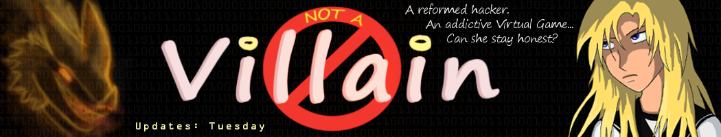
Not A Villain Webcomic
Webcomic of a semi- reformed hacker trying to redeem herself in a post- apocalyptic world she may have created.
Home
About
The Game
Contact
Archive
Characters
Store
Extras
Dude the Great
Q&A Sessions
FanArt
AneekaChannel
RSS Feed
«
‹
∞
›
»
«
‹
∞
›
»
‘Not A Villain’ Webcomic -Page 688
And Danni practices her tact.